I’ll never forget the first time I tried to create a gallery wall above my sofa. What started as a simple decorating project turned into a comedy of errors – crooked frames, mismatched spacing, and enough nail holes to make my wall look like Swiss cheese. After that disaster, I made it my mission to learn how to do it right.
What’s the secret to creating a gallery wall that actually looks good above a sofa? After helping friends with their spaces and making plenty of mistakes in my own home, I’ve discovered it’s all about planning, proportion, and personality. The right gallery wall can transform your living room from basic to brilliant in just one weekend.
The Classic Symmetrical Layout
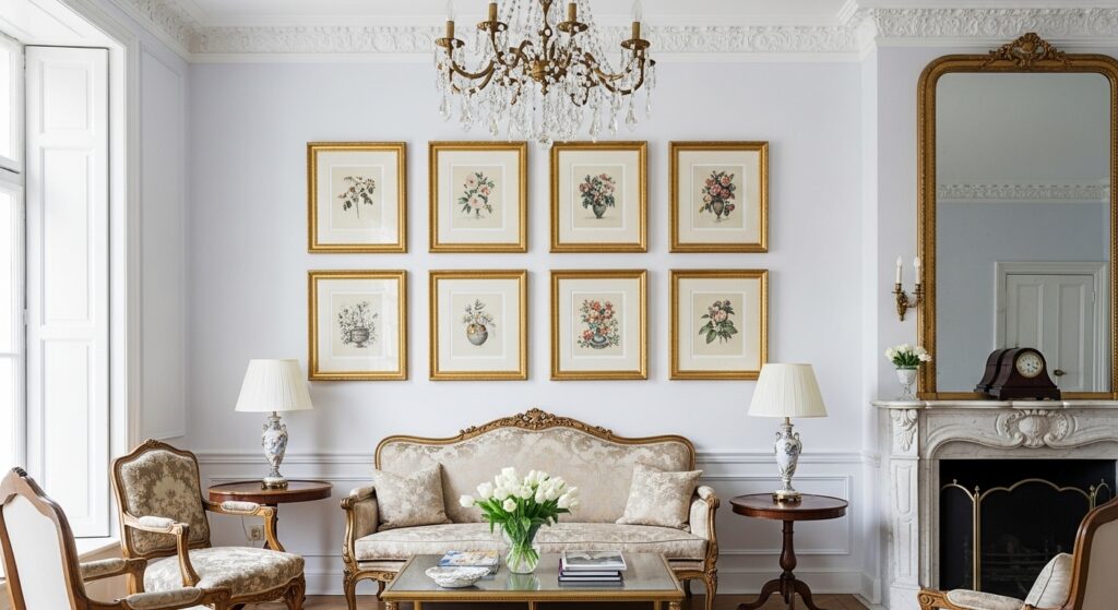
My first successful gallery wall used a symmetrical grid that even my perfectionist mother approved of. This foolproof approach works because it creates balance in the space. I started with nine matching black frames arranged in three rows of three.
The key is measuring carefully before you start. I used painter’s tape to mark the exact spacing on the wall first. Each frame sits exactly four inches apart, creating clean lines that look intentional. For content, I chose black and white family photos with simple white mats to keep things cohesive.
This style works especially well behind sofas because the clean lines complement the furniture without competing with it. My current version uses slightly larger frames in the center that graduate to smaller ones at the edges, which helps draw the eye inward.
The Organic Cluster Approach
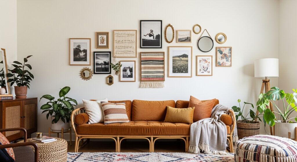
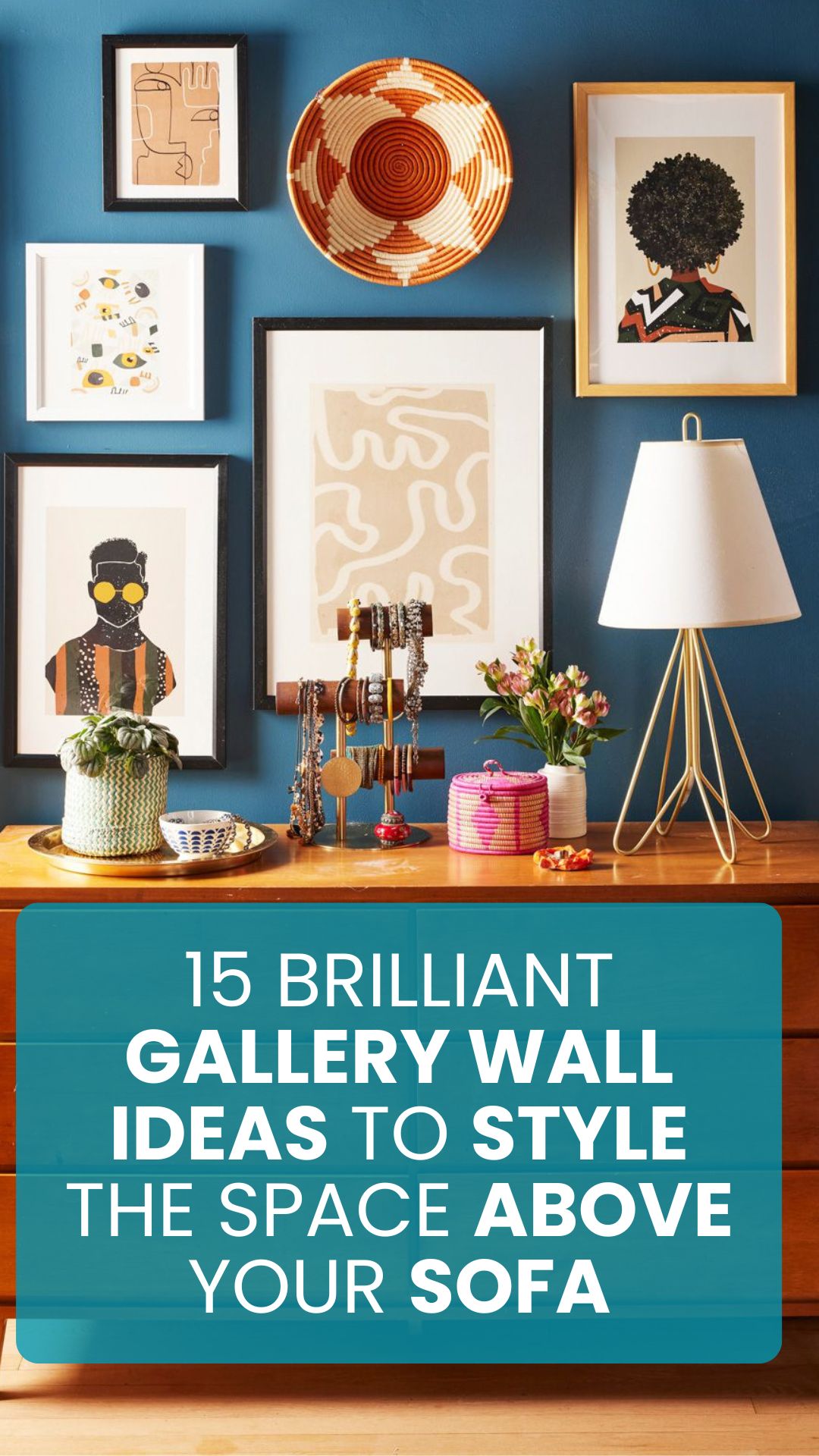
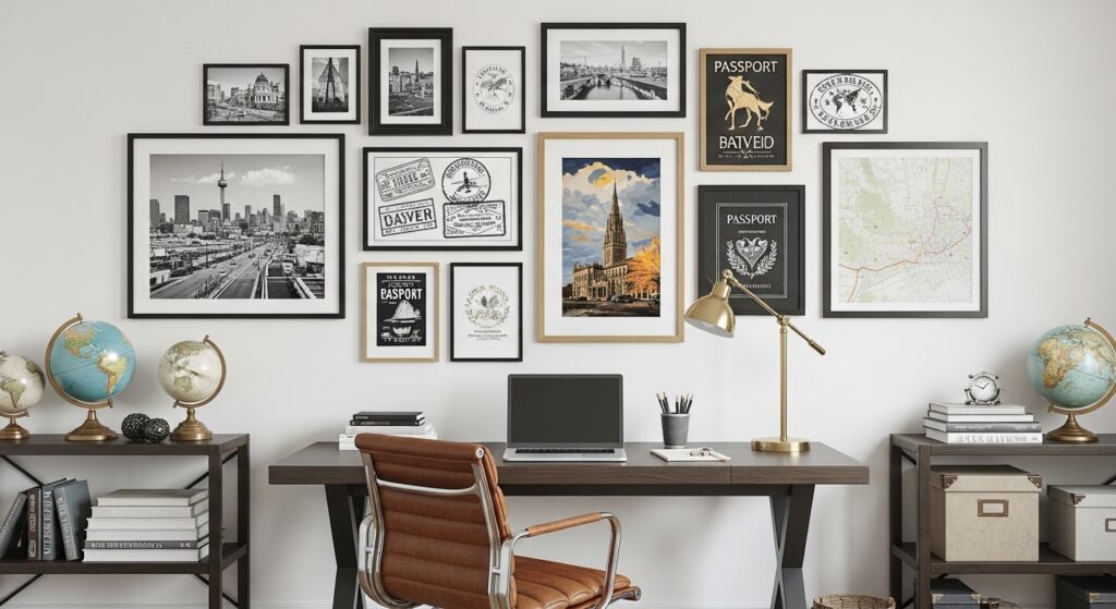
When I wanted something less rigid than my first attempt, I tried an organic cluster layout. This freeform style looks collected over time rather than perfectly planned. I started with one large central piece – a vintage map of my hometown – then built outward.
The trick is varying frame sizes and orientations while maintaining some visual balance. I mixed square and rectangular frames in different finishes but kept all the mats white. Small decorative objects like a brass compass and miniature paintings add variety between the frames.
This approach works well for people who want a cozy, lived-in feel. I add to mine gradually whenever I find interesting pieces at flea markets or thrift stores. The evolving collection tells the story of my travels and interests.
The Oversized Statement Piece
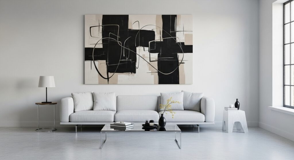
Sometimes less really is more. In my small apartment, a single large piece above the sofa made more impact than a crowded gallery wall. I found a dramatic black and white landscape photograph that spans nearly the width of my sofa.
The scale creates a bold focal point without overwhelming the space. I hung it at eye level when standing, which makes the ceiling appear higher. For added interest, I placed two small sconces on either side that cast warm light across the textured surface.
This minimalist approach works particularly well in modern spaces or rooms with other strong design elements. It proves you don’t need multiple pieces to make a statement.
The Salon-Style Mix
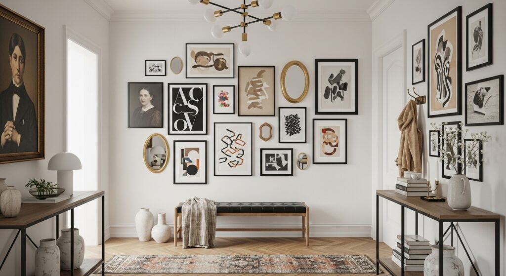
Inspired by Parisian galleries, I created a salon-style wall that extends from above the sofa all the way to the ceiling. This dramatic approach uses varying frame sizes arranged in an artful cascade.
I started with the largest piece at the bottom center and worked upward with progressively smaller items. The mix includes oil paintings, framed textiles, and even decorative plates. Gold frames tie everything together despite the variety of artwork.
This style works best in rooms with high ceilings. It turns the wall into a conversation starter and makes the sofa area feel grander. Just be sure to secure heavier pieces properly – I learned this after a vintage frame took a nosedive onto my cushions.
The Themed Collection
For my movie-loving friend, I helped create a gallery wall of vintage film posters above her sofa. The unified theme makes what could look cluttered appear intentional and stylish. We used simple black frames with white mats to let the colorful posters shine.
Other themed ideas could include:
- Travel souvenirs and maps
- Botanical prints
- Family heirlooms
- Concert posters
The key is maintaining some visual consistency through frame style or color palette. Our movie wall uses the same frame for every poster, with equal spacing between them.
Final Thoughts: Start Small and Have Fun
The best gallery walls evolve over time. My current wall has changed three times in five years as my tastes and collections have grown. Start with a layout that matches your confidence level – maybe just three frames to begin with.
Remember there are no real rules, just guidelines. That weird painting your kid made? Frame it. The concert ticket stub from your first date? Include it. When I stopped stressing about perfection and started choosing pieces that made me happy, my gallery wall finally felt right.
The easiest way to begin? Measure your sofa, mark the space with painter’s tape, and start playing with arrangements on the floor first. Your future self will thank you when you don’t have to patch dozens of unnecessary holes.
Want to try the simplest option first? Go with three large matching frames in a row. It’s foolproof and looks instantly polished. Just be warned – once you start, you might catch the gallery wall bug like I did. Now I’m constantly rearranging and adding new pieces.